RNAseq Differential Expression Visualization
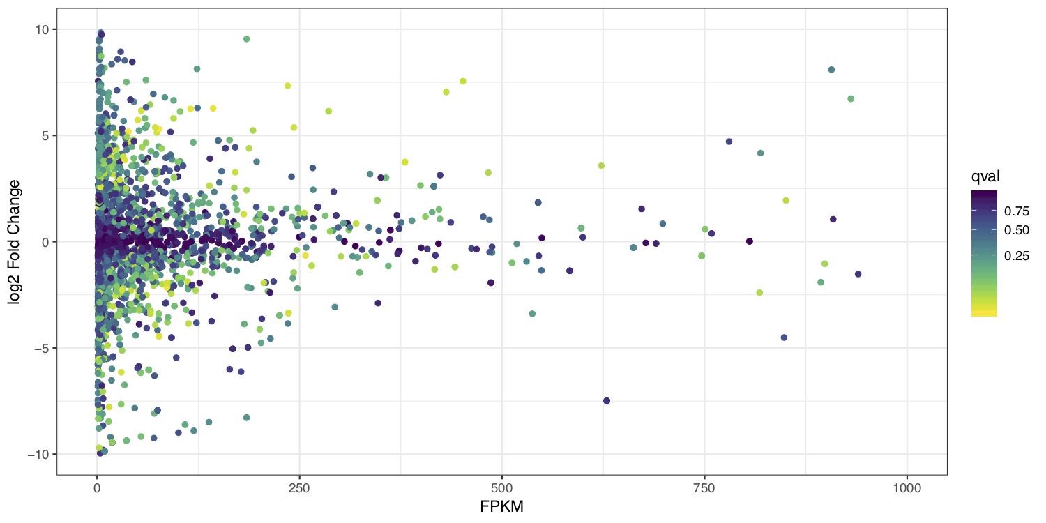
MA plots display a log ratio (M) vs an average (A) in order to visualize the differences between two groups. In general we would expect the expression of genes to remain consistent between conditions and so the MA plot should be similar to the shape of a trumpet with most points residing on a y intercept of 0. We dont have average, and only have 1 sample anyway so we can’t construct a true MA plot however we can construct a hybrid that will still be informative by plotting the FPKM expression values from stringtie on the x-axis and the log2 fold change given by ballgown on the y-axis.
Let’s go ahead and start R to construct this plot.
# start R
R

# set the working directory
setwd("~/workspace/rnaseq")

# load libraries
library(ggplot2)
library(viridis)

# load in the ballgown DE data
de_genes <- read.delim("RNAseq_gene_results.tsv")

# load in the FPKM values from stringtie
expr_tumor <- read.delim("~/workspace/rnaseq/ballgown/RNAseq_Tumor_gene_abundance.out")

# merge the expression and DE results
merged_results <- merge(de_genes, expr_tumor, by.x=c("id"), by.y=c("Gene.ID"), all.x=TRUE)

# log2 the fold change
merged_results$log2_fc <- log2(as.numeric(merged_results$fc))

# remove entries with an FPKM of 0
merged_results <- merged_results[merged_results$FPKM > 1,]

# create an MA plot for both genes and transcripts
pdf(file="ma_plot.pdf", height=5, width=10)
ggplot(data=merged_results) + geom_point(aes(y=log2_fc, x=FPKM, color=qval)) + ylim(c(-10, 10)) + xlim(c(0, 1000)) + scale_colour_viridis(direction=-1, trans='sqrt') + theme_bw() + xlab("FPKM") + ylab("log2 Fold Change")
dev.off()
at the end your ma_plot.pdf should look something like the example below: